Introduction to R, RStudio and RShiny - Create your own dashboards
Table of Contents
With our R package you can easily retrieve your Castor data in real time. You can use the data to create dashboards with R, RStudio, and Shiny. In this article we will give you steps to get started.
Installing R and RStudio
- Install R from https://www.r-project.org/
- Install RStudio from https://rstudio.com/products/rstudio/download/
Retrieve Castor data in RStudio
- Retrieve the data in RStudio with our R package castoRedc.
Create dashboards with RShiny
- Use the R package Shiny to create dashboards. See: https://shiny.rstudio.com/
- Related video and written tutorials can be found at: https://shiny.rstudio.com/tutorial/
An example applied to a Castor study can be found below as well as in this webinar. - Ready to use graphs and diagrams can be found at: https://shiny.rstudio.com/gallery/ These graphs already contain R code from which you can draw inspiration.
The structure of a Shiny app
Shiny apps are contained in a single script called app.R, which has 3 components:
- The user interface (ui), in which the layout and appearance of the app are defined.
- The server, which defines instructions to build the app.
- A piece of code to run the app
See also the example below.
Example for dashboard based on data in Castor EDC
In the example below, you can see:
- The installation of packages
- Authentication
- Retrieving study and report data
These steps are also explained in this article. After that, the Shiny app is created. This example is based on the Telephones by Region example. This example and other examples can be viewed on the Gallery of Shiny from RStudio.
In this example code, we have 2 fields in our study that are retrieved in the 'studydata' variable:
- province - which is a dropdown field containing the province that a patient lives in
- admission - which is a radio button field containing the specific hospital department that a patient is admitted to
# Install packages ----
install.packages("remotes")
remotes::install_github("castoredc/castoRedc")
install.packages("shiny")
library(castoRedc)
library(shiny)
# Authentication ----
castor_api <- CastorData$new(key = ("YOUR_CLIENT_ID"),
 secret = ("YOUR_CLIENT_SECRET"),
 base_url = "https://data.castoredc.com")
# Retrieve data ----
studydata <- castor_api$getStudyData("YOUR_STUDY_ID")
reportdata <- castor_api$getReportInstancesBulk("YOUR_STUDY_ID")
### SHINY APP ###
### In this example we will create a bar plot which you can filter on province
# Define UI for the Shiny app ----
# We use a 'fluidPage' to define a page for the Shiny app
ui <- fluidPage(
 # Give the page a title
 titlePanel("Number of patients in provinces"),
 # Generate a row with a sidebar
 sidebarLayout(
 # Define the sidebar with one input
 sidebarPanel(
 selectInput("provincie", "Province:",
 choices=studydata$province),
 ),
 # Create a spot for the barplot
 mainPanel(
 plotOutput("patientsPlot")
 )
 )
)
# Define a server for the Shiny app ----
server <- function(input, output) {
 # Fill in the spot we created for a plot
 output$patientsPlot <- renderPlot({
 # Retrieve summarized data about admissions, based on the selected province
 counts <- summary((subset(studydata, province == input$provincie))$admission)
 # Render a barplot
 barplot(counts,
 main=input$provincie,
 ylab="Number of Patients",
 xlab="Department")
 })
}
# Launch app ----
shinyApp(ui = ui, server = server)
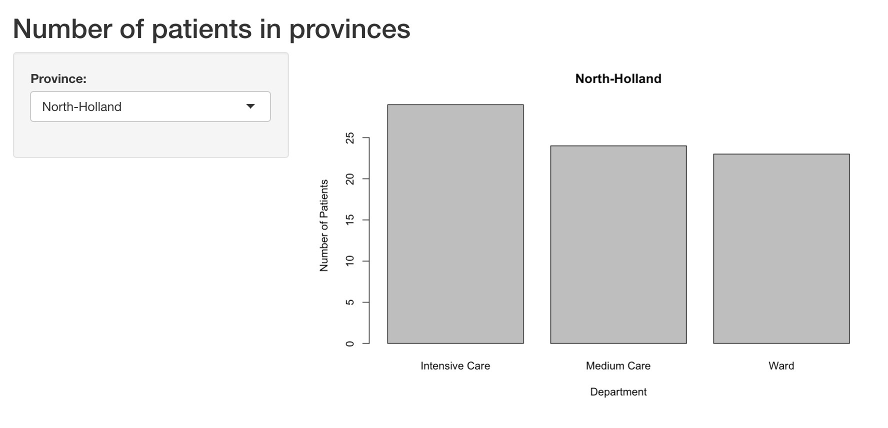
The output will look like this: